
I’m a math adjunct and aspiring data scientist working through the “Practical Deep Learning for Coders” course by fast.ai (you can read about my experience with Lesson 1 here), and for Lesson 2, we’re to gather a set of images from Google Images to create and train a deep learning model to classify the images.
I begin by trying to work through the Lesson 2 notebook without watching the lecture, because it seemed to be suggested by the Lesson 1 wiki, but get absolutely nowhere. Some people did get it done before Lesson 2 was recorded! I guess it’s not a race, and not being the fastest isn’t a reason to quit. Once I watch the lecture, I have a much easier time figuring out how to work in the notebook, particularly In Jeremy’s “experimentalist” style.
First, I need to decide what types of images to classify. Binary classification — where an image is either One Thing or a Different Thing, not Something Else Entirely, nor a combination of the two Things — sounds like a good option, but since I need to be able to assess how well the model is performing, the classifications it’s making need to be something I have domain expertise in. I have an M.S. in pure math, and consider doing something involving math, but don’t think of anything between digit recognition (done to death beautifully by MNIST), and something far more complex than I’m ready to implement. I also have three children, and those two areas are probably the two I could consider myself to have “expertise” in. So, something to do with parenting and binary classification… aha!
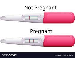
We think of pregnancy tests as being either positive or negative, but there are also two more ambiguous cases that look quite similar to one another: faint positives, and evaporation lines, which are negative. There exist many forums — such as PeeOnAStick.com— full of people with extensive experience interpreting pregnancy tests. One might hope digital pregnancy tests would take this guesswork out of testing, but digital tests often read “Inconclusive” or “Negative” for early faint positives, and won’t read give an accurate result until a few days later in the pregnancy, when hormone levels have increased.
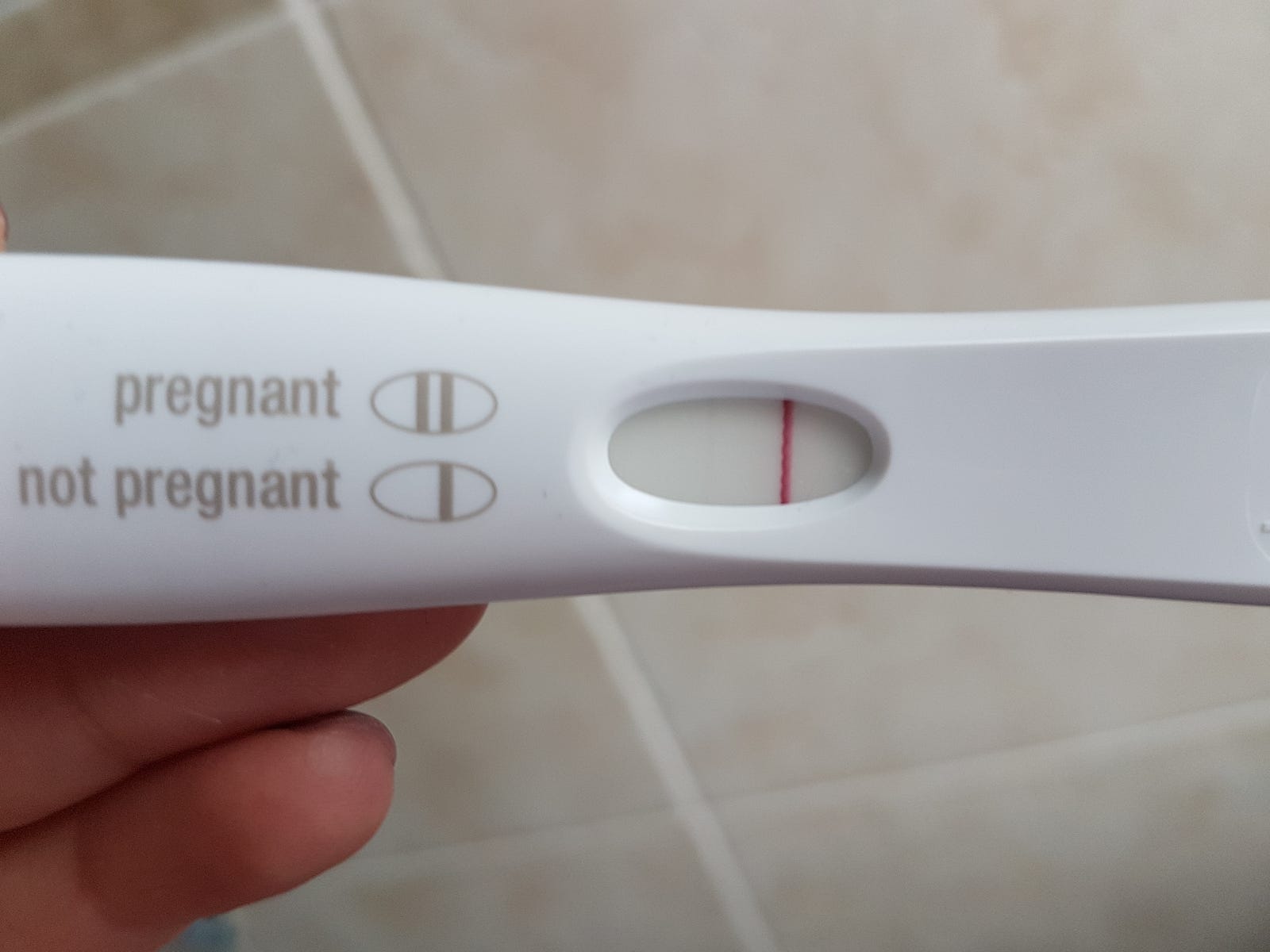
Here’s an example of faint positive:
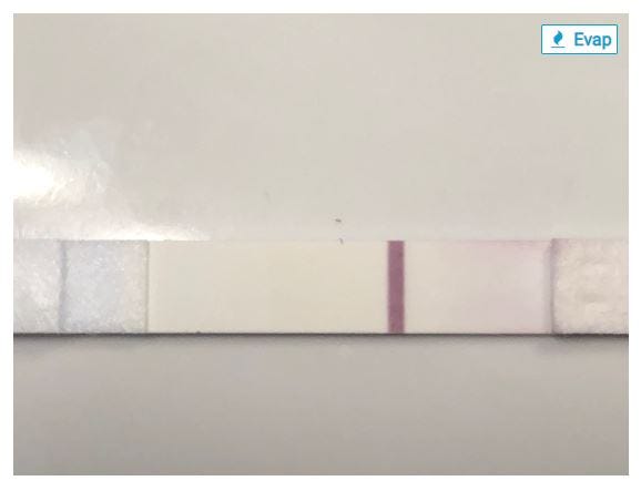
And here’s an evaporation line:
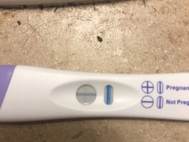
The evaporation line is darker than the faint positive above, but this is a negative test! This is the tricky bit. The chart below gives some insight as to the differences between the two:
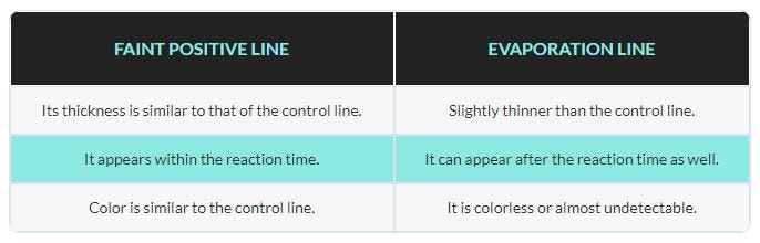
The evaporation line is thinner than the control line, so that’s one way we can identify it. However, it’s easy to see how this can be hard for humans to spot, so I wonder what chance my model will have. It would be good to know if a model has already been made to classify such images, so that I can compare my model’s accuracy to that of one previously published, and I find a study that used machine learning to predict the accuracy of pregnancy tests, but I don’t find any studies done using machine learning to classify faint positive vs. evaporation line specifically.
Having chosen a project, I Google “faint positive pregnancy test” and “pregnancy test evaporation line,” and follow the instructions in the lecture to download the images for each to .txt files. It’s also a .txt file in the lecture video, but in the notebook, it’s looking for .csv. No big deal to change that, but it’s a thing.
Then there’s another thing. I follow Jeremy’s instructions, but get the following error message and explanation:
Okay, so this wasn’t stated in the lecture, but the function we’re using in the fastai library is explicitly looking for a file whose name begins with “urls_”. I change my file names accordingly, and all’s well.
Viewing the data goes fine, though I can see there are some images that’ll be hard for the model to classify, because either the tests aren’t in focus, or the image doesn’t have a test in it at all. Much worse, however: lots of the images that come up when I search for evaporation lines were posted by people asking if the result was an evaporation line or a faint positive, which more often than not were, in fact, faint positives, so those images are going to be in my data set with “evaporation line” labels, but should actually be labeled as “faint positive”. I predict this will be the most significant source of inaccuracy for my model. I won’t worry about that yet, though; I know from the lecture that after we run the model the first time, we’ll do some hyperparameter tuning and manual data cleaning, if needed (Narrator: it was definitely going to be needed).
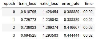
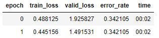
So I train the model, with the following results:
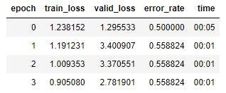
So I have a training loss of .9, a validation loss of 2.78, and an error rate of .56. Pretty terrible, but I’ll press on.
I go through the notebook cells dealing with the learning rate, but I’m not planning to do any hyperparameter tuning until after I’ve cleaned the data, since I already know it’ll be messy.
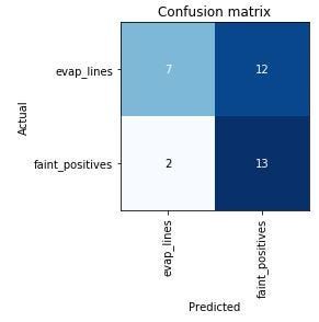
Here’s the “confusion matrix” for this first run:
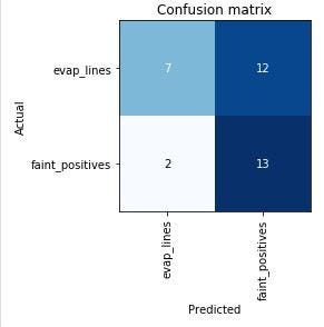
This shows that of the tests the model predicted to be evaporation lines, 7 were correctly identified, and 2 were incorrectly identified as faint positives. Of the tests predicted to be faint positives, 13 were correctly identified, and 12 were incorrectly identified as evaporation lines. Since I know that a majority of the evaporation line images were mislabeled by the users who posted them, though, this is more or less what I expected to see. The model is likely more accurate than it thinks it is!
Now I’ll clean the data. Here’s the first batch:
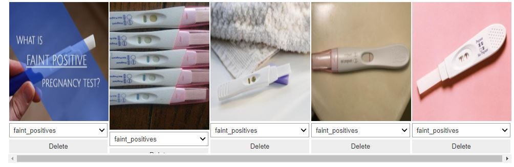
The first image has text covering the test, while the third image is too small and the test windows are too dark to determine a classification, I think, so I delete those. I can change the labels on the images as well, so I can switch the ones labeled as evaporation lines that should be labeled as faint positives. Then I recreate the databunch with just the cleaned data. I’m not particularly optimistic that this will increase the model’s accuracy to the very high rates achieved by the models shown in the lecture, because the tests display results in different configurations: some show a + when positive, while others show a single line if negative, two lines if positive. So if the model is just counting lines, it’s going to have a hard time. We’ll see.
The ImageCleaner function creates a cleaned.csv file for the cleaned data set, and I create a new ImageBunch using that file, then train the model again.
My training set loss went down by 0.2, my validation set loss went down by 1.5, and my error rate went down by .12. Let’s look at the new confusion matrix:

Just like I thought, the model is still classifying 12 faint positives as evaporation lines, and the faint positive lines can be so faint I’m not at all surprised that it’s confused. Adding in the different styles of test result displays, the model has the deck stacked against it.
To improve the accuracy, I think I need to get a much better set of evaporation line images than can be found by grabbing images from Google. I might also need to train different models for different brands, but I’d like to see if I can get decent accuracy with just one model first (one model to rule them all?). Countdown to Pregnancy has images of tests that can be sorted by brand, as well as by result. I select “All brands,” and “Evap,” and get hundreds of images, so I start over with the new data. These are self-tagged by users, so some will still be mislabeled, but the image quality is leaps and bounds better than what I got from Google Images. I think my original faint positive images were basically fine, so I’m keeping those. The only way I know to get the images’ URLs into .txt files is the way the notebook does it, but when I do this, I get only an empty file of file type “File” instead of .txt. I look around online, and find this script that uses Python to scrape the image URLs of any webpage. Okay, now we’re getting somewhere! <ominous music plays>
The script downloads the full URLs of the user’s avatar image next to each test photo, but for some reason cuts off the first half of the URLs of the images of the tests. I realize that if I continue to use this method, I’m going to have to remove all the URLs of the images I don’t want, and also fix the URLs of the ones I do want. Just copying and pasting all the individual URLs of the images I want would be faster, but still pretty inefficient.
Even worse, I just realized the images from Countdown to Pregnancy have a serious flaw. Here’s an example. Can you spot the problem?
I heard a podcast recently about a deep learning model that was trained to spot cancerous skin growths, and while it was astonishingly accurate, eventually the researchers realized that the model had worked out that all of the images it was given of cancerous growths had rulers in them, and the non-cancerous ones didn’t have rulers, so it was looking for rulers, not cancer. These photos of evaporation lines all have an “Evap” tag in the upper right corner! The images are great, but the tag is a big downer.
But it turns out that if I download the images, the tag disappears! I consider learning how to scrape the images, but since I realized above that half the images on each page aren’t what I want, that method doesn’t seem promising for this purpose. Instead, I install the Image Downloader Continued extension on Chrome, which lets me click on the images I want to download. Manually selecting each image feels pretty inelegant, but that’s precisely what I would have to do later to remove noisy images otherwise, so I’m going with it.
I upload the images into the evap_lines folder, and run my model again.
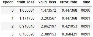
That’s still pretty bad. Here’s the Learning Rate Finder graph:
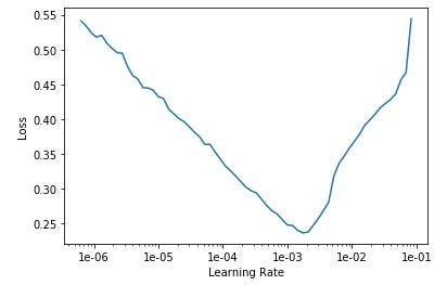
I try setting the learning rate to a range of 1e-5 to 1e-4:
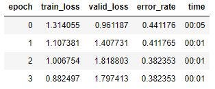
Run it again:
That’s the lowest training set loss I’ve had, and the validation loss and error rate have improved, but not nearly to the standards we’re going for. Here’s the confusion matrix:

Once again, nearly all of the errors are faint positives classified as evaporation lines. Improving the quality of the evaporation line images helped, but I think I’m going to have restrict the model to classifying just one brand, rather than all brands, due to the inconsistencies in the way results are displayed, as described a bit above.
I choose ClearBlue Easy, because it’s a popular test (lots of images!), and also because blue dye tests seem to be most prone to evaporation lines. I download about 100 images each of evaporation lines and faint positives (“faint” is a judgment call on my part), and run the model once more.
This is still not working well. I know my data is as good as it can get from user-identified images now, so I’m ready to try some hyperparameter tuning. I set my learning rate to a range between 1e-06 and 1e-04:

A little better. Maybe run more epochs? Nope, I get essentially the same result.
I’m too new at this to say for sure, but I think it’s very possible that the error rate is as low as I’ll be able to get it without a better source for my image sets. I’ve learned a lot from this project — about working in Jupyter notebooks, the fastai library, how to downloaded URLs and images from webpages, etc. — and perhaps I’ll pick it up again at some point, if I think of a better approach, but for now I’m going to leave this project here, then select a less tricky classification problem and start again.
Previous post: Getting Started with fast.ai
Lesson 2 (the sequel): Can Deep Learning Perform Better than Pigeons?
Lesson 3: 10,000 Ways that Won’t Work
Lesson 4: Predicting a Waiter’s Tips
Lesson 5: But Where Does the Pickle Go?
Lesson 6: Everybody Wants to be a Cat
I’m a mathematics lecturer at CSU East Bay, and an aspiring data scientist. Connect with me on LinkedIn, or say hi on Twitter.